Interior

Interior

How to create a balanced and functional space design?

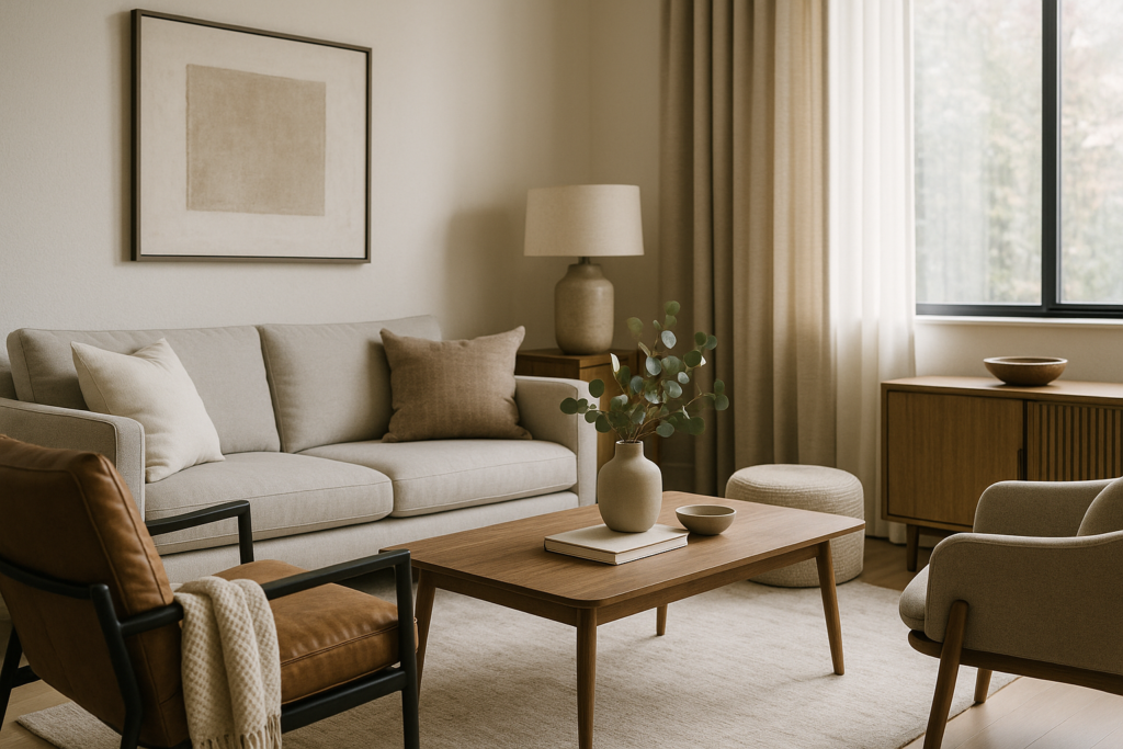
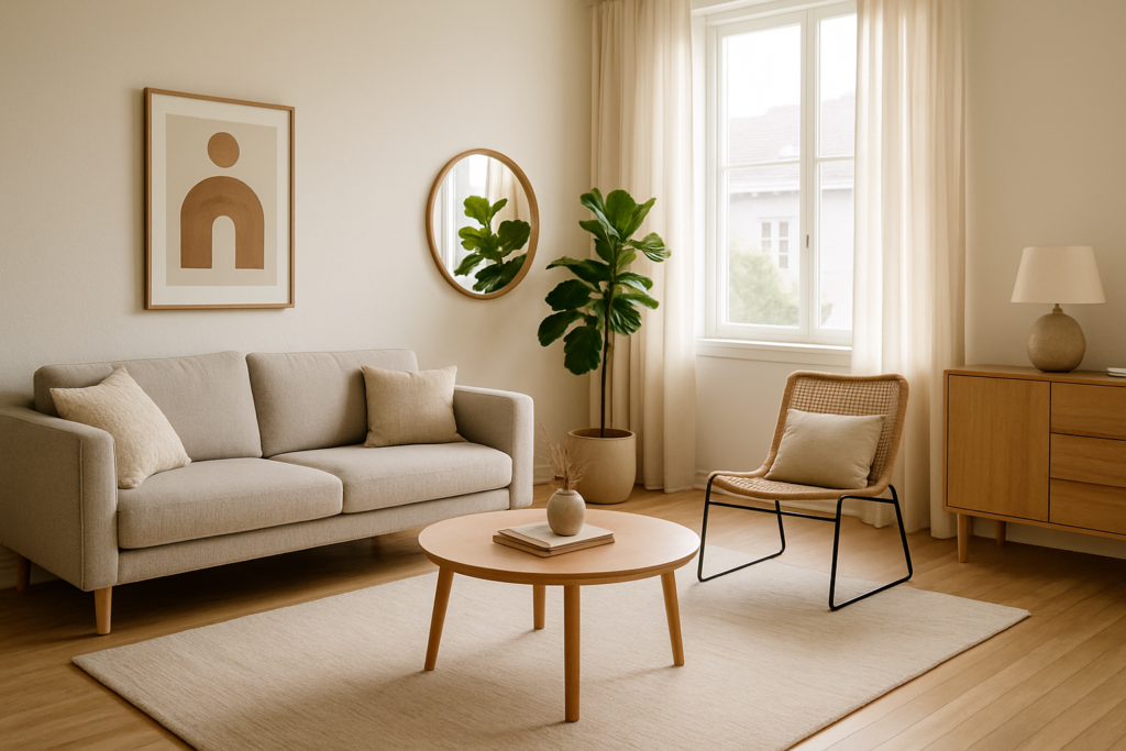
Look, I’ve been designing spaces for over twenty years now and if there’s one thing I’ve learned… it’s that balance isn’t just some fancy word designers throw around. It’s literally the difference between a space that works and one that drives you crazy every single day. ## **The Truth Nobody Tells You About Balanced Design** You know that feeling when you walk into a room and something just feels… off? Yeah, that’s usually because someone forgot about balance. And I’m not just talking about making sure your couch isn’t lopsided (though please, check that too). Balance in design is like cooking a great meal. You need the right ingredients in the right amounts. Too much of anything and the whole thing falls apart. ## **Start With Function, Always** Here’s where most people mess up – they start with Pinterest boards and Instagram saves. Wrong move. **Ask yourself these questions first:** – How do you actually live in your space? – What drives you nuts about your current layout? – Where do things always pile up? (be honest) – What do you wish you had more room for? I worked with a family last month who had this gorgeous dining room they never used. Meanwhile, they’re eating dinner on TV trays in the living room every night. We turned that dining room into a homework station slash craft room. Now? They use it daily. That’s functional design. ## **The Three Types of Balance You Need** ### **1. Visual Balance** This is what most people think of. It’s about making sure your space doesn’t look like it’s going to tip over. But here’s the secret – perfect symmetry is boring. You want what we call “visual weight” distributed evenly. Big dark bookshelf on one side? Balance it with maybe two lighter pieces on the other. Or a large piece of art. The key is it should feel equal, not look identical. ### **2. Functional Balance** This is where the magic happens. Every zone in your space needs to actually work for what you’re doing there. **Kitchen example:** If your coffee maker is on one side of the kitchen and your mugs are stored on the complete opposite side… that’s not balanced. That’s annoying. Group things by function. ### **3. Emotional Balance** Okay this might sound woo-woo but stick with me. Your space needs both energizing areas and calming spots. All high-energy colors and busy patterns? You’ll feel exhausted. All beige and whisper-quiet? Might as well live in a doctor’s waiting room. ## **My Go-To Formula for Any Room** I use this whether I’m designing a tiny granny flat or a massive multi-residential project: **The 60-30-10 Rule** – 60% dominant element (usually your main color or biggest furniture pieces) – 30% secondary element (supporting colors, medium furniture) – 10% accent (the fun stuff – pillows, art, that weird lamp you love) Works. Every. Time. ## **Common Mistakes That Kill Balance** Listen, we all make these. I’ve made them. You’ve probably made them. Let’s fix them: **Pushing all furniture against walls** – I know, I know. You want to maximize floor space. But floating furniture creates better flow and actually makes rooms feel bigger. **Ignoring scale** – That tiny coffee table with your massive sectional? Not working. That enormous dining table in your modest eating area? Also not working. Scale matters more than style. **One light source syndrome** – If you only have one overhead light, your space will never feel balanced. Layer it: overhead, task lighting, ambient. Changes everything. ## **The Sydney Factor** Look, designing in Sydney comes with its own challenges. Those heritage restrictions, the crazy block sizes, the need for BASIX compliance… it’s a lot. But here’s the thing – constraints often lead to the most creative solutions. I recently worked on a triplex design where we had to work around three massive fig trees. Instead of fighting it, we designed around them. Each unit now has its own private tree view. Balance isn’t always about starting fresh – sometimes it’s about working with what you’ve got. ## **Quick Wins for Better Balance Today** **Rearrange before you renovate.** Seriously. Move your furniture around. Try floating that sofa. Switch your bedside tables. Free design experiment right there. **Create a focal point in each room.** Could be artwork, could be a window, could be that vintage bar cart you scored. Just pick ONE per room. **Check your traffic flow.** Can you walk through your space without doing the furniture slalom? No? Time to rethink placement. **Bring the outside in.** Plants, natural light, maybe a water feature if you’re feeling fancy. Nature knows balance better than any designer. ## **When to Call in the Pros** Honest truth? Sometimes you need fresh eyes. When you’ve lived in a space for years, you develop blind spots. You stop seeing the potential. That’s where good building design comes in. Whether it’s a full renovation, a new build, or just reimagining your existing space… sometimes you need someone who can see past your everyday and show you what’s possible. ## **Final Thought** Balance isn’t about perfection. It’s about creating a space that works for YOUR life. Not your neighbor’s life. Not some influencer’s life. Yours. Start small. Fix one thing that bugs you. Then another. Before you know it, you’ll have a space that actually feels right. And if you’re stuck? Well, that’s what we’re here for. Sometimes the best investment you can make is getting the design right from the start. Trust me on that one. *Remember – great design isn’t about following rules. It’s about knowing when to break them.*

Interior

What are the key elements of interior design?

Look, I’ve been in this game for a while now… and if there’s one thing I’ve learned about interior design, it’s that people make it way more complicated than it needs to be. You know what drives me crazy? When designers throw around fancy terms and make you feel like you need a degree just to pick out a couch. That’s not what good design is about. Not even close. So let me break down the **real** elements that matter when you’re designing a space. Whether it’s your first home in Sydney or you’re working on a multi-residential project, these fundamentals stay the same. ## **Space – The Foundation Nobody Talks About** Here’s the thing… before you even think about colors or furniture, you gotta understand your space. I mean really understand it. – How does light move through the room during the day? – Where are the awkward corners that everyone pretends don’t exist? – What’s the natural flow when you walk in? I’ve seen too many beautiful rooms that just don’t *work* because someone ignored the basics. You can have all the trendy furniture in the world, but if you’re bumping into things every five seconds? That’s not good design. ## **Light – Your Secret Weapon** Okay, this is where it gets interesting. Natural light? That’s gold. But here’s what most people miss – it’s not just about having big windows. It’s about understanding how that light changes throughout the day. Morning light in a bedroom hits different than afternoon light in a living room, you know? And artificial lighting… don’t get me started. One overhead light is NOT a lighting plan. You need: – **Task lighting** for actually doing stuff – **Ambient lighting** for mood (yeah, mood matters) – **Accent lighting** to show off that art you spent too much on Layer these right, and suddenly your basic room looks like a magazine spread. ## **Color – It’s Not Just Paint** Everyone obsesses over paint colors. Should I go greige? Is navy too dark? But color is everywhere – your floors, your furniture, that random throw pillow your aunt gave you. The trick? Start neutral and build. I don’t care what Instagram tells you – you don’t need to paint everything black or millennial pink. Find a base that works with your light (see how this all connects?) and add color through things you can actually change. Because trust me… repainting is a pain. ## **Texture – The Game Changer** This is what separates amateur hour from the real deal. A room with just smooth surfaces? Boring. Dead. Lifeless. Mix it up: – Rough timber against smooth stone – Soft linens with hard metals – Glossy finishes next to matte surfaces Texture adds depth without adding clutter. It’s like seasoning for your room. ## **Balance – Not What You Think** Forget what they taught you about symmetry. Real balance is about visual weight. A massive dark sofa on one side? Balance it with something substantial on the other – maybe a gallery wall or a tall plant. But here’s the kicker… perfect symmetry is actually kinda boring. Life isn’t symmetrical. Your space shouldn’t be either. ## **Function – Because You Actually Live Here** I cannot stress this enough – **your space needs to work for YOUR life**. Got kids? That white sofa is a terrible idea, I don’t care how good it looks. Work from home? You need proper storage, not just a laptop on the dining table. Love hosting? Your layout better support that. Good design supports how you actually live, not how you think you should live. ## **Personality – The Missing Ingredient** Here’s what no design school will tell you… the best interiors have soul. They tell a story. YOUR story. Those perfectly staged homes in magazines? Nobody actually lives like that. Real homes have: – Books you actually read – Art that means something to you – That weird chair you inherited but somehow love Don’t hide these things. They’re what make a space feel like home. ## **The Bottom Line** Look, whether you’re designing a granny flat or a whole multi-residential complex, these elements don’t change. Scale them up, scale them down, but the fundamentals remain. Good interior design isn’t about following trends or copying what you see online. It’s about creating spaces that work, feel good, and reflect the people who use them. And if someone tries to tell you it’s more complicated than that? They’re probably trying to sell you something. — *Need help bringing these elements together in your Sydney home or development project? Sometimes a fresh pair of experienced eyes makes all the difference. Let’s chat about your space.*

Interior

How to design a duplex home?

So you’re thinking about designing a duplex? Good choice. Really, it’s one of the smartest moves you can make in today’s property market. I’ve been in this game for a while now, and let me tell you – duplex design isn’t just about slapping two homes together and calling it a day. Nope. It’s an art form that requires careful thought, smart planning, and honestly? A bit of creativity to make it all work. ## **Why Duplexes Make Sense Right Now** Look, property prices aren’t getting any cheaper. And if you’re sitting on a decent-sized block in Sydney (or anywhere really), you might be sitting on a goldmine. A duplex lets you: – **Double your rental income** – two homes, two income streams – **House extended family** while keeping your sanity intact – **Sell one side** and live in the other – basically having your cake and eating it too – **Make the most of your land** – because why waste good space? But here’s the thing… designing a duplex isn’t like designing a regular house. There’s more to think about. ## **Starting With Site Analysis (The Boring But Critical Bit)** Before you even think about floor plans or fancy kitchens, you need to understand your site. And I mean REALLY understand it. First up – **check your zoning**. Not all blocks can have duplexes. Some councils are picky about this stuff. You’ll need to look at: – Minimum lot sizes – Street frontage requirements – Setback rules – Height restrictions Trust me, nothing kills a dream faster than finding out halfway through that your council won’t approve it. Next, walk your block. Where does the sun hit? Where’s the noisy street? Got any big trees you want to keep? These things matter more than you think. ## **The Golden Rules of Duplex Layout** Alright, now for the fun stuff. When I’m designing duplexes, there are some rules I never break: ### **1. Privacy is Everything** Nobody wants to hear their neighbor’s TV through the wall. Or worse… other things. So: – Put living areas on opposite ends – Bedrooms should never share walls if you can help it – Use clever landscaping to create visual barriers – Think about window placement – no one wants to stare into next door’s bathroom ### **2. Each Side Needs Its Own Identity** Just because it’s a duplex doesn’t mean it should look like one. I always try to give each side its own: – Separate entrance (obviously) – Different facade treatments – Individual outdoor spaces – Unique street presence ### **3. Don’t Skimp on Storage** This is where lots of duplex designs fail. People think “smaller space = less stuff”. Wrong. You still need: – Decent garage space – Linen cupboards – Pantry storage – Maybe even a small shed area ## **Smart Design Tricks That Actually Work** Over the years, I’ve picked up some tricks that make duplexes feel bigger and better: **Mirror layouts** – but flip them. Same rooms, opposite arrangement. It’s efficient and keeps plumbing costs down. **Central courtyards** work magic. They bring in light, create privacy, and give each side their own outdoor oasis. **Go up, not out**. If your block’s tight, think vertical. Two stories give you more flexibility with layouts. **Shared driveways** save space but design them wide enough. Nothing worse than playing car tetris every morning. ## **The Approval Process (Yes, It’s a Process)** Here’s where things get… interesting. Council approvals for duplexes can be tricky. You’ll need: – **Development Application (DA)** or sometimes a **Complying Development Certificate (CDC)** – **BASIX Certificate** for energy efficiency – Detailed architectural plans – Sometimes neighbor notifications My advice? Don’t try to DIY this part. The amount of times I’ve seen people waste months because they missed one small requirement… it’s painful. ## **Budget Realities** Let’s talk money. Because that’s what it always comes down to, right? A duplex typically costs about 1.5 to 1.8 times what a single home would cost. Not double – there are economies of scale. But you need to factor in: – Design and approval costs – Site prep (sometimes more complex) – Two of everything (kitchens, bathrooms, etc.) – Potentially higher construction standards for fire separation But remember – you’re getting two properties for less than the cost of two. That’s the beauty of it. ## **Common Mistakes to Avoid** I see these all the time: – **Forgetting about bins** – where do two households put their rubbish? – **Not planning for visitors** – where do guests park? – **Identical designs** – boring and harder to rent/sell – **Skimping on soundproofing** – biggest complaint in duplexes – **Ignoring natural light** – dark duplexes feel cramped ## **Making It Happen** So you’re convinced? Good. Here’s your next steps: 1. **Get a site feasibility done** – know what’s possible before you dream too big 2. **Talk to a building designer** who knows duplexes (hint: not all do) 3. **Set a realistic budget** – then add 10% for the unexpected 4. **Think long-term** – will this design work in 10 years? 20? Look, designing a duplex isn’t rocket science. But it’s not exactly simple either. It’s about finding that sweet spot between maximizing your investment and creating homes people actually want to live in. The best duplexes? They don’t feel like duplexes at all. They feel like two beautiful, independent homes that just happen to share a piece of land. And that’s the goal, really. Creating something that works for everyone – you, future tenants or buyers, the neighborhood, and yes, even the council. Got questions? That’s normal. Duplex design is a journey, not a destination. But with the right approach and the right team… it’s a journey worth taking. *Ready to explore your duplex potential? Sometimes the best first step is just having a conversation about what’s possible.*

Scroll to Top